
Responsive design is usability under real mobile conditions.
All insights
Web design · FIELD NOTE 14
Responsive Website Design: Why Mobile UX Wins Jobs in 2026
Published Jan 21, 2026Updated Aug 7, 20268 min read
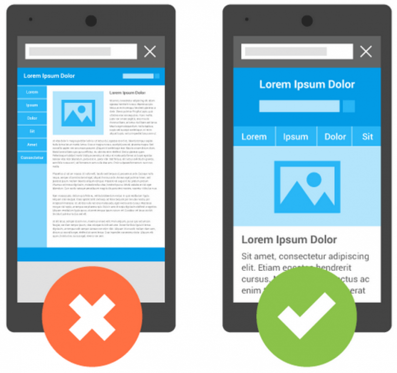
Responsive website design means your site works cleanly across phones, tablets, and desktops without a broken mobile experience. In 2026 that is baseline for SEO and conversion, yet many business sites still fail tap targets, bury the phone number, or ship desktop-only forms. Magic Web Studios builds responsive premium websites that convert when demand shows up on a phone.
- Connected web · search · voice · CRM
- Your team stays in control
- Built to close demand, not vanity metrics
Human review gateAI prepares, your team decides
Same-day response pathVoice + CRM, not a black hole
Premium craft standardBuilt for conversion, not templates
Southern California rootsLocal markets · national systems
What responsive web design must include in 2026
Fluid layouts, readable type, thumb-friendly CTAs, fast image delivery, and forms that work with mobile keyboards. Also: obvious click-to-call and no hover-only navigation that strands touch users.
How responsive design affects SEO and Core Web Vitals
Search systems reward usable pages. Core Web Vitals, mobile usability, and clear structure support visibility. A pretty desktop mock that collapses on phones is unfinished SEO work.
Mobile conversion patterns for service company websites
Sticky call actions, short forms, trust near CTAs, and service-area clarity above the fold. Design for interruptible users, driveway, job site, or office parking lot.
- 01Primary CTA visible without hunting
- 02Forms under a handful of essential fields
- 03Proof (reviews, badges) near the ask
- 04Fast load on mid-tier mobile networks
Responsive design systems scale multi-location sites
Quality holds when components are systematic, headers, cards, forms, and footers that behave the same across services and cities. That is how multi-location service sites stay maintainable and SEO-friendly.
KEY TAKEAWAYS
What to carry into the next decision.
SEO performance and design quality are linked.
Service brands need obvious call and form paths on mobile.
Design systems beat one-off page heroics.
Test on real devices, not only desktop browser resize.
APPLY & ANSWER
Quick answers from this field note.
Scannable responses for operators and answer engines reviewing this insight.
01What is the main takeaway from “Responsive Website Design: Why Mobile UX Wins Jobs in 2026”?
Responsive design is usability under real mobile conditions.
02How should a service business apply this note?
SEO performance and design quality are linked.
03What should I do next after reading?
Service brands need obvious call and form paths on mobile.
FROM NOTE TO SYSTEM
Is your site fine on a monitor, and awkward on a phone?
We map the smallest serious system for your market, web, search, voice, and follow-through designed together.
FIELD TO PRACTICEInsight → Decision → Connected build
LET’S MAKE THE CONNECTION
Bring the market and the pressure point.
Chat with Ava, try a voice demo, or try a browser voice demo. Keep the context from this note in the conversation.
Ready when you areQuote, or talk with Ava